Colour accuracy isn’t a “nice‑to‑have”; it’s the difference between loyal customers and expensive returns. Nearly 11 % of consumers send back products because of colour issues, and 58 % say they won’t purchase again after a mismatch.
Conversely, accurate colour builds trust and improves ad performance. This section delivers a repeatable system for colour‑true flat‑lay photography, from setup through shooting and editing.
True Fabric Colour Isn’t a “Looks Good” Problem, It’s a Return‑Rate Killer
Colour should look the same across devices and match the physical product. True colour means repeatable results: if you shoot a blue shirt today and tomorrow, it should look the same.
Incorrect colour carries hidden costs: higher return rates, negative reviews, diminished trust and wasted ad spend. A professional appearance can boost conversions by 33 % and colour accuracy is part of that professionalism.
Why Fabric Colour Goes Wrong in Flat‑Lay Photos
Despite good cameras, many flat‑lay photos suffer from colour problems. Here are seven common colour killers:
- Mixed lighting: Combining daylight and artificial bulbs produces unwanted colour casts. Squareshot’s guide notes that mixed lighting often creates unnatural colour shifts, so stick to a single light temperature.
- Low‑quality LEDs: Cheap lights have poor colour rendering (low CRI), making reds or greens look off. Invest in high‑CRI (90+) continuous lights or strobes.
- Auto white balance drift: Camera auto settings can vary shot to shot. Manual white balance or a custom setting using a gray card solves this.
- Background bounce: Bright or coloured backdrops reflect onto fabric and change its hue. Neutral backgrounds reduce this risk.
- Overexposure: When highlights blow out, texture and true colour disappear. Watch histograms and adjust exposure accordingly.
- Phone HDR/computational processing: HDR algorithms on smartphones sometimes oversaturate colours. Shoot in Pro/RAW mode to minimise automatic adjustments.
- Uncalibrated monitors: Editing on screens that aren’t calibrated leads to false “corrections.” Calibrate monitors regularly using a colourimeter.
The “Colour Triangle”
Colour accuracy relies on three pillars:
- Light quality: Use high‑CRI lights with a stable colour temperature.
- White balance reference: Include a neutral gray card or colour checker in every session to set a baseline.
- Colour‑managed editing and export: Work in a consistent colour space (sRGB for web), calibrate your monitor and embed profiles when exporting.
Gear That Actually Improves Colour Accuracy
High‑CRI continuous lights (LED panels or strobes) with daylight‑balanced bulbs (5000–5600 K) deliver accurate colour. Softboxes or light tents diffuse light to reduce harsh shadows and maintain consistency. Diffusion materials such as scrims or white curtains help control reflections and glare.
The 3 Must‑Have “Colour Truth” Tools
| Tool | Best for | Pros | Watch‑outs |
|---|---|---|---|
| Gray card | Quick neutral reference | Cheap, simple, fast | Doesn’t fix tough hues |
| Colour checker | Brand‑level consistency | Provides full colour profiling; great for batch calibration | Needs consistent workflow |
| Tripod/overhead rig | Consistency across shots | Prevents changes in angle and distance | Requires space and setup |
Backdrop Choice Matters More Than Most People Think
Neutral backgrounds (white, light gray, unbleached canvas) prevent colour bounce. Pure white backgrounds reflect light evenly, but be careful: they can blow out texture on very light fabrics.
A light gray or beige surface is a safe alternative, retaining contrast without casting tints. Avoid saturated colours behind clothing because they can tint whites and delicate hues.
Set Up the Scene for Consistency
Build a No‑Surprises Shooting Zone
- Block uncontrolled ambient light: Close curtains and turn off overhead lights to avoid mixed lighting.
- Lock light placement: Mark positions of lights with tape. Changing light distance or angle affects colour temperature and shadow density.
- Lock camera height/angle: Use a tripod or overhead rig. Consistent geometry ensures colours appear the same shot after shot.
Prep the Clothing so Colour Reads Correctly
Steam or iron garments to remove wrinkles that create dark shadows. Lint and dust removal prevents small particles from catching light and altering highlights. Style garments to enhance shape without creating unnatural folds that cast colour‑shifting shadows.
Flat‑Lay Lighting Setups That Protect True Colour
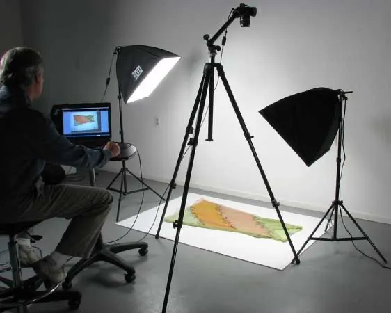
Setup A — The “E‑Commerce Standard”
Two lights at 45° angles reduce harsh shadows and provide even illumination. Test for evenness by running a hand across the garment and checking for uniform shadow density. If one side appears darker, adjust the light or reflector until balanced.
Setup B — Window Light That Stays Accurate
For small batches or budget shoots, use window light with diffusion (sheer curtains or scrims). Avoid mixed sources and shoot at consistent times of day. Remember to adjust white balance frequently—natural light changes quickly.
Setup C — Cross‑Polarised Lighting for Tricky Fabrics
When dealing with shiny, reflective or synthetic materials, cross‑polarised lighting is invaluable. Place a linear or circular polariser on the light source and another on the camera lens. Rotate the lens polariser until reflections disappear. This technique eliminates glare and keeps colour saturation intact.
Quick Comparison Table
| Setup | Best for | Colour accuracy | Speed | Risk |
|---|---|---|---|---|
| Two‑softbox standard | Most apparel catalogs | High | High | Low (requires investment in lights) |
| Window + diffusion | Small batches, lifestyle shoots | Medium–High | Medium | Medium (weather/time dependent) |
| Cross‑polarised | Shiny/reflective fabrics | Very High | Medium | Medium (learning curve, extra gear) |
Camera Settings That Stop Colour From “Jumping” Between Photos
Shoot in RAW rather than JPG. RAW preserves data, allowing you to correct white balance and exposure in post. Use manual exposure to maintain consistent brightness.
Fix ISO and shutter speed across the session; inconsistent settings cause perceived colour shifts. Don’t rely on automatic HDR or computational modes when colour accuracy is the priority.
White Balance: The Difference Between “Close” and “Correct”
- Custom white balance using a gray card: Place the card in the same light plane as the garment. Use it to set white balance in camera or during RAW processing.
- Colour checker workflow: For large batches or strict brand colour, shoot a frame with a colour checker at the start. Use the software to create a custom camera profile and apply it to the entire session. This is more accurate than a single gray card for tough hues.
- Kelvin manual white balance: If lighting is stable and you know the temperature (e.g. 5500 K), set it manually. This works well for continuous LED setups.
Lens + Distance Rules That Keep Colours Believable
Avoid wide‑angle lenses (below 35 mm equivalent) because they distort perspective and can make colours appear slightly different across the frame. Use a standard lens (35 mm to 50 mm) and keep distance consistent across products to ensure uniform colour perception.
The “Colour Reference Workflow” Brands Use
Implement this 60‑second routine to fix 80 % of colour problems:
- Place the garment and include a gray card or colour checker in the same plane.
- Take a reference shot.
- Remove the card and shoot the final image.
- In editing, sample the gray card to set white balance and apply that setting to all images from the session.
- For colour checkers, use dedicated software (like Adobe Camera Raw or X‑Rite) to generate a custom profile and synchronise across the batch.
Gray Card vs Colour Checker
| Tool | Best for | Pros | Watch‑outs |
|---|---|---|---|
| Gray card | Quick white balance | Portable, inexpensive | Doesn’t correct all hues |
| Colour checker | Brand consistency | Provides custom profiles for accurate colours | Requires software and workflow |
Photoshop Workflow for True Fabric Colour (Without “Pretty but Wrong” Edits)
Step 1 — Set the Correct Foundation
Confirm your working colour space (sRGB for web). Ensure your editing software recognises the camera profile or apply a neutral profile. Avoid using artistic presets or filters that alter colour.
Step 2 — Correct White Balance Using the Reference
Use the gray card or colour checker shot to set neutral white balance. Synchronise this adjustment across all images from the session to ensure consistency.
Step 3 — Match Fabric Colour While Protecting Texture
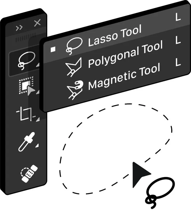
Use curves to adjust overall tonality. Apply HSL (Hue/Saturation/Luminance) adjustments in moderation to nudge stubborn hues. Selective colour adjustments can fix specific colour channels. Protect texture by masking adjustments and preserving mid‑tone contrast; avoid heavy smoothing or sharpening.
Step 4 — Background Cleaning Without Tinting the Garment
Use targeted selections to clean backgrounds. When brightening the background, protect the garment with a mask to prevent colour bleed. Maintain a slight shadow under the garment to anchor it visually.
Step 5 — Batch Consistency Workflow
Create presets based on your lighting setup. Apply these presets to the entire batch, then fine‑tune “hero” images individually. This speeds up editing while maintaining high standards.
Hard Colours & Difficult Fabrics: The Real Test of “True Colour”
- Black clothing turning gray: Use side lighting and a backlight for edge separation. In editing, lift shadows selectively without raising black levels across the entire image.
- White fabrics looking yellow or blue: Use neutral backgrounds and soft light. Keep highlights within safe limits to preserve weave texture and avoid colour casts.
- Reds, purples and neons going off: Cheap lights struggle with saturated hues. Use high‑CRI lights and moderate saturation adjustments in editing.
- Heather, knits and textured weaves: Increase micro‑contrast using local clarity or structure adjustments to show texture. Avoid global contrast changes that shift colour.
- Glossy prints, satin and synthetics: Cross‑polarisation reduces glare and keeps colours rich. If unavailable, adjust angles or use diffusers to control hotspots.
A Simple “Colour Accuracy QA” Checklist Before Publishing
- White balance is consistent across all SKUs.
- Fabric texture is visible—neither smeared nor overly sharpened.
- No colour casts on whites or neutral grays.
- Shadow density is consistent; shadows influence perceived colour.
- Background matches your store style and is free from random tints.
- Colours look stable on a phone screen, a laptop and another phone (quick reality check). Monitor calibration is essential.
- Same items look identical in listing thumbnails and expanded views.
- Saturation isn’t clipped; avoid oversaturated edits.
Red Flags That Scream “Not True Colour”
Different whites across the same product set or inconsistent colour between front and back shots. Over‑processed images that hide fabric reality or oversaturated colours that misrepresent the product. Watch for moiré patterns in fine prints.
Export Settings That Keep Colours Accurate Online
Use sRGB colour space and embed profiles when exporting. This prevents browsers from interpreting colours incorrectly. JPG and WebP are both suitable; WebP reduces file size by 30–50 % and is supported on Shopify and major browsers. Save images at high resolution (2000–3000 px long edge) with moderate compression to balance quality and load speed.
Marketplace & Shopify Consistency Tips
Standardise your long‑edge size for zoom functionality. Apply consistent sharpening across your gallery; over‑sharpening can alter perceived texture and colour. Provide images for each colour variant to avoid surprising customers; save each colour in its own file rather than recolouring in post.
“Colour Expectation” Helpers That Reduce Returns
Offer a close‑up texture shot to show fabric weave. Present a colourway lineup in one frame to show all options under the same light. For premium products, include a neutral reference (like a gray card or known white object) in one image to reassure colour accuracy.
Fast Workflow for 50–500 Products
Shoot Plan
- Create a shot list: front flat lay, back, detail close‑ups (texture, label), colour reference shot.
- Use a consistent naming convention for easy tracking.
- Keep light and camera positions marked. For large batches, keep a log of settings and any changes.
Edit Plan
Adopt a batch‑first, hero‑second approach. After synchronising white balance and exposure, identify a “hero” image for each garment (usually the main front view) and fine‑tune its colour. Use this hero as a reference for all other images of the same garment.
Production Table
| Batch size | Shoot time focus | Edit time focus | Biggest risk |
|---|---|---|---|
| 1–20 | Dialing in light/WB | Careful manual colour match | Inconsistent setup |
| 20–100 | Repeatability | Batch sync workflow | Rushing QA |
| 100–500 | System + templates | Automation + spot checks | Mixed lots/lighting drift |
Conclusion
True fabric colour in flat-lay apparel photography isn’t about making products look “nice”—it’s about accuracy, consistency, and trust. The right lighting, locked camera settings, neutral backgrounds, and a simple colour-reference workflow can eliminate most colour errors before they happen.
When you control colour from shoot to export, you reduce returns, protect your brand credibility, and create product images that convert confidently across Shopify, marketplaces, and ads.
FAQs: How to Shoot Flat‑Lay Apparel Photos With True Fabric Colour
1. Why is colour accuracy so important in flat-lay apparel photos?
Because inaccurate colour leads to higher return rates, negative reviews, and lost customer trust.
2. What lighting is best for true fabric colour?
High-CRI (90+) daylight-balanced lights at 5000–5600K provide the most accurate colour.
3. Should I use auto white balance for flat-lay photography?
No. Auto white balance can shift between shots. Use custom or manual white balance instead.
4. Is a gray card enough for colour accuracy?
A gray card works for basic white balance, but a colour checker is better for strict brand consistency.
5. What background colour works best for flat-lay apparel?
Neutral backgrounds like white, light gray, or beige reduce colour bounce and unwanted tints.
6. Should I shoot JPG or RAW for accurate colour?
RAW. It preserves colour data and allows precise white-balance and exposure correction.
7. Why do flat-lay colours look different across devices?
Uncalibrated monitors, missing colour profiles, and incorrect export settings cause colour shifts.
8. How can I keep colour consistent across large batches?
Lock lighting and camera settings, use a colour reference shot, and batch-sync edits.
9. What fabrics are hardest to photograph accurately?
Black, white, red, neon, glossy, and textured fabrics like lace or knits.
10. How to Shoot Flat-Lay Apparel Images With True Fabric Color?
Use high-CRI lighting, lock white balance and camera settings, shoot in RAW on a neutral background, and edit/export in sRGB to keep fabric colors accurate and consistent.

