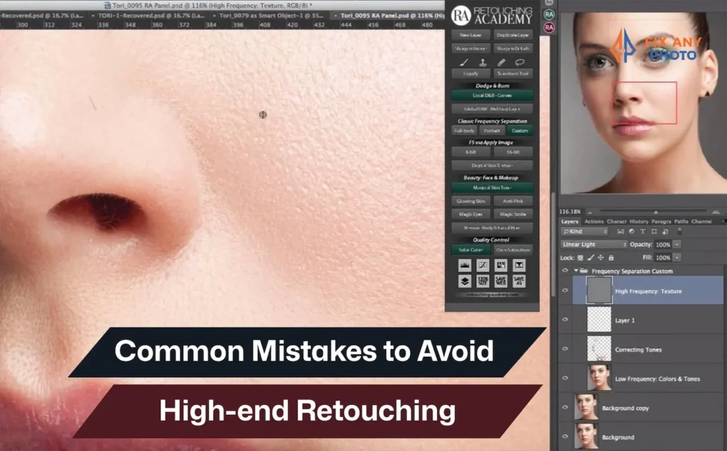
E-commerce killed the fitting room, and replaced it with images. Today, a single product photo decides whether a garment gets added to the cart or abandoned for a competitor. That shift has turned retouching into a business-critical skill, not just a creative one.
In fashion and clothing e-commerce, even small retouching mistakes can be costly. Push an edit too far and premium fabric starts to look cheap. Lose texture and shoppers lose trust. Modern buyers want polish, but they demand realism.
This guide exposes the high-end retouching mistakes that quietly damage credibility and sales. It’s not a generic tutorial or a technical checklist.
It’s a practical, insight-driven breakdown of what goes wrong in real editing workflows, and how to fix it. If clothing images need to look premium, believable, and conversion-ready, this is where the real work begins.
Why “High-End” Retouching So Often Looks Cheap
High-end retouching is easier than ever, but great results are not. Powerful software and AI tools have blurred the line between access and expertise.
The truth is simple: luxury images don’t come from luxury tools. They come from judgment, restraint, and a trained eye.
Most high-end retouching fails because edits are pushed too far. Skin gets plastic. Fabrics lose texture. Light stops feeling real. Expensive garments start to look artificial and mass-produced.
The biggest myth? That advanced tools guarantee premium results. Overused frequency separation, heavy smoothing, and one-click presets erase the tactile details luxury brands rely on. Cotton should show grain. Silk should reflect light naturally. Linen should feel textured not airbrushed.
Great retouching is invisible. The moment editing becomes noticeable, trust is lost. Viewers may not know why an image feels wrong, but they feel it instantly.
Professional retouching enhances without erasing. Distractions go, character stays. Amateur editing removes imperfections and ends up removing believability.
High-end retouching isn’t about fixing reality. It’s about refining it, without stripping away its soul.
Over-Retouching Skin: The Fastest Way to Ruin a Premium Image
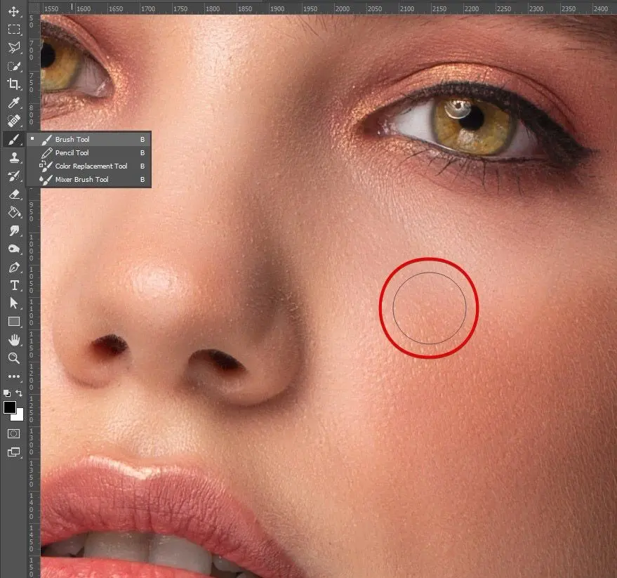
Skin retouching is a major part of fashion and e-commerce editing, and the most common place where high-end images fall apart. Skin is a balance of tone and texture.
Push smoothing too far and living skin turns plastic, stripping the image of personality and realism. When pores disappear and fine hairs blur together, the subject stops feeling human and starts looking like a mannequin.
That loss of authenticity quietly damages both the image and the brand behind it.
What Over-Retouched Skin Really Looks Like
Over-retouched skin isn’t just smooth, it’s collapsed. Tonal depth flattens, highlights become waxy, and shadows lose clarity. Texture may remain in one area while vanishing in another: a sharp neck paired with blurred shoulders, or a detailed forehead next to lifeless cheeks.
These inconsistencies create visual discomfort. Viewers may not name the problem, but they feel it instantly. High-end retouching demands consistent texture and believable tone across the entire face and body, not a uniformly airbrushed surface.
Why Skin Texture Is Non-Negotiable in High-End Retouching
Luxury is tactile. Just as premium fabrics communicate quality through visible weave and grain, skin communicates authenticity through pores, fine lines, and subtle variation. Editorial realism depends on this texture. When skin is reduced to flat tone and reflected light, it loses credibility.
A face with natural texture feels real and touchable; an overly polished face feels artificial. In clothing imagery, skin is part of the product story. Destroying it undermines the luxury narrative the image is meant to sell.
Why This Mistake Happens So Often
Over-retouched skin usually comes from workflow errors, not bad intentions.
- Overusing frequency separation Setting blur radii too high or using the low-frequency layer to “smooth everything” flattens facial structure and erases natural transitions.
- Smoothing before fixing tone Applying blur or plastic smoothing early in the workflow destroys shading that can’t be rebuilt later. By following a proper retouching sequence, professionals ensure they correct tone first, then refine texture.
- Staying zoomed in too long Editing at extreme zoom encourages obsessive cleanup. Details that are invisible at normal viewing sizes get erased, leaving skin that looks synthetic when zoomed out.
High-End Fix: Micro Dodge & Burn and Zoom Discipline
The solution is precision, not blur. Micro dodge & burn evens out skin by adjusting tiny highlights and shadows while preserving texture. Using low-flow brushes on neutral layers builds volume instead of flattening it.
Most of this work should be done zoomed out, focusing only on imperfections that actually register to the viewer. Tiny details should be left alone. When the skin looks luminous, dimensional, and human, the job is done. High-end retouching succeeds when it knows when to stop.
Frequency Separation Abuse: When a Pro Tool Becomes a Problem
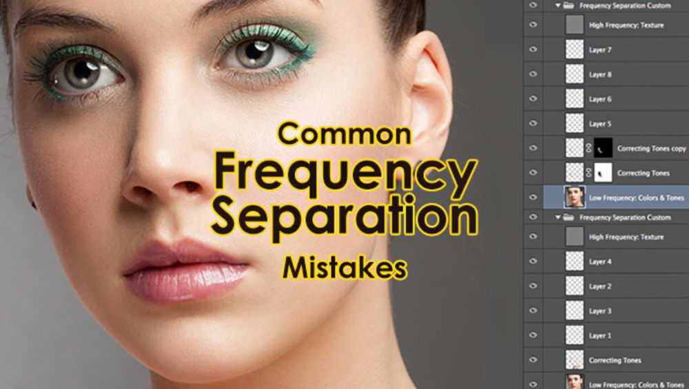
Frequency separation is one of the most powerful tools in clothing and fashion retouching. Used correctly, it smooths wrinkles and uneven tone while preserving fabric texture. Used poorly, it flattens skin, erases weave, and turns premium garments into lifeless color blocks.
How Frequency Separation Is Commonly Misused
The most common mistake is choosing the wrong blur radius. When the low-frequency layer is blurred too heavily, or used to clean everything, natural texture disappears. Skin becomes flat color.
Fabric loses seams, stitch definition, and weave detail. Beginners often compound this by blurring even more to “fix” the result, sacrificing realism for speed.
In clothing images, this leads to washed-out denim, soft pockets, and garments that no longer feel tactile.
When Frequency Separation Actually Works
Frequency separation works best for localized problems, not global fixes. It’s ideal for evening out uneven color on collars, softening minor wrinkles on silk, or cleaning small blotches without touching texture.
In e-commerce, it helps refine garments while keeping knit patterns, stitching, and fabric grain intact. Think of it as a precision tool, not a shortcut.
How Professionals Use It Without Killing Texture
- Choose the right radius
The blur should remove color variation while keeping texture visible on the high-frequency layer. If texture disappears, the radius is too strong. - Tailor it to the material
Different surfaces need different settings. Skin, hair, denim, silk, and wool all behave differently. Separate frequency setups prevent one-size-fits-all damage. - Pair it with dodge & burn
Use frequency separation to fix color issues, then rely on dodge & burn to shape light and volume. This keeps depth and realism intact. - Keep everything reversible
Work on new layers and mask carefully. If an edit flattens fabric drape or shape, it should be easy to pull back without rebuilding the file.
Frequency separation isn’t the enemy, misuse is. When treated as a supporting technique instead of a cure-all, it becomes a powerful ally in high-end retouching rather than a texture killer.
Breaking Light Logic: The Fastest Way to Flatten an Image
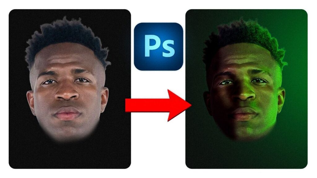
Great photography is built on light. High-end retouching should support that light—not overwrite it. When edits ignore direction, intensity, or falloff, depth disappears and garments lose their three-dimensional presence.
What “Broken Light” Looks Like
Flat retouching happens when highlights and shadows stop making sense. Shadows get erased, highlights are painted where they don’t belong, and everything starts to sit on the same visual plane.
Faces lose structure, lips and eyebrows look pasted on, and clothing folds stop reading as form. The image may be smooth, but it no longer feels real.
Why Light Matters More Than Smoothness
Light defines shape. It gives volume to a jacket, depth to pleats, and structure to a face. Remove or misplace it, and even premium fabrics look cheap. Luxury isn’t about brightness—it’s about controlled contrast and believable depth.
How to Retouch Without Breaking Light
- Work with existing light
Enhance natural highlights and shadows instead of flattening them. Keep edits small and directional. - Use the original as a guide
Constantly reference the unedited image to stay aligned with real light flow. - Refine shadows, don’t erase them
Clean muddy areas while preserving depth and contrast. - Think in 3D
After retouching, the subject should still feel sculpted and separated from the background.
High-end retouching succeeds when light still tells the story. Once light logic breaks, the image loses its premium feel, no matter how smooth it looks.
Fabric & Product Retouching Mistakes That Kill Brand Trust
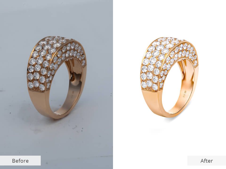
In clothing e-commerce, the product matters more than the face. Fabric retouching mistakes can quietly damage trust by making garments look unnatural, cheap, or misleading.
Wrinkles, seams, texture, and shape must be refined carefully. While expert execution elevates your product’s appeal, over-editing breaks realism and hurts credibility.
Common Fabric Retouching Mistakes
- Over-smoothing wrinkles
Wrinkles should be controlled, not erased. Heavy smoothing flattens fabric and destroys natural drape. - Liquify distortions
Overusing Liquify bends seams, warps patterns, and changes the true shape of the garment. - Texture loss on premium materials
Blurring to remove wrinkles often removes weave. Silk turns plastic, wool loses softness, and denim looks fake. - Ignoring gravity and structure
Poor ghost mannequin work can make clothing float unnaturally, which immediately signals bad editing.
Why Fabric Texture Builds Buyer Trust
Texture communicates quality. Buyers expect to see the weave of cotton, the softness of cashmere, and the grain of denim. When texture disappears, the product feels misrepresented. That mismatch leads to disappointment, returns, and lost trust.
High-End Fabric Retouching Rules
- Fix shape before smoothing
Correct garment structure with careful warping, not blur. Keep seams and patterns straight. - Control wrinkles without flattening
Use dodge & burn or light frequency separation to soften creases while preserving texture. - Respect fabric physics
Clothes should fall naturally, even in ghost mannequin images. - Keep lighting and color consistent
Match highlights, shadows, and color across the entire garment so it looks realistic and accurate.
High-end fabric retouching isn’t about perfection. It’s about honesty, structure, and texture—because trust sells more clothes than flawless edits ever will.
Global Adjustments: Why One Slider Should Never Fix Everything
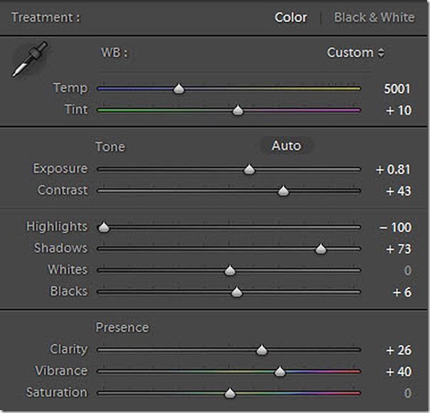
Global sliders for clarity, contrast, and saturation are convenient, but dangerous. Push them too far and skin turns orange, midtones disappear, and depth is lost. The same applies to fabrics: red velvet goes neon, silk looks harsh, and fine textures get exaggerated.
The Problem with Blanket Adjustments
Global edits ignore material differences. Contrast that works on denim can make white cotton look dirty. Warming an image may fix one color cast while ruining another. Clarity can enhance details, but also exaggerate wrinkles and seams.
Why High-End Retouching Uses Micro-Adjustments
Professional retouching starts locally. Specific shadows, tones, and textures are corrected with masks and targeted layers. Only after these fixes does subtle global grading bring everything together. The result is balance, every area edited just enough, never too much.
High-end retouching isn’t about stronger sliders. It’s about precise control.
Poor Layer Structure: The Hidden Professional Red Flag
You can tell a professional retoucher by their file structure. Clean, named, and grouped layers signal control and experience. Random layers, early flattening, and destructive edits signal the opposite.
This isn’t just messy, it’s costly. In e-commerce workflows where revisions are constant, poor structure turns simple feedback into a nightmare.
Clear Signs of Amateur Files
- Flattened too early – Adjustments become impossible to refine.
- No logical grouping – Skin, fabric, and color edits mixed together.
- Destructive edits – Erasing pixels or applying filters directly to the background.
Why Non-Destructive Workflow Matters
High-end retouching requires flexibility. Clients request tweaks, color shifts, shape changes, tonal adjustments. Non-destructive layers, masks, and adjustment layers make this fast and safe without degrading quality.
Best-Practice Structure
- Work entirely non-destructively using adjustment layers, masks, and Smart Objects.
- Group layers by function (cleanup, fabric, skin, color, final polish).
- Use Sample All Layers for cloning and healing.
- Keep before/after groups for instant comparison.
Good retouching looks invisible. Good file structure proves professionalism.
Inconsistent Skin Tones: A Subtle Mistake Clients Always Notice
Perfect skin on the face means nothing if the neck, hands, or arms don’t match. Uneven skin tones instantly break realism and are one of the most common complaints in beauty and fashion imagery. In e-commerce, this inconsistency damages brand trust and visual consistency.
Why It Happens
Retouching often stops at the face. Color and cleanup are perfected there, while the neck and hands are ignored. Different lighting across the body adds natural variation, and global color corrections rarely translate evenly, creating the dreaded “floating head” effect.
How High-End Retouchers Keep Tones Consistent
- Match tones first – Balance warmth and brightness across face, neck, and hands before beauty work.
- Separate color from light – Adjust luminance and color independently to preserve natural shading.
- Work on a calibrated monitor – You can’t fix what you can’t accurately see.
- Check at real sizes – Review at 100% and at normal viewing size to catch subtle mismatches.
High-end skin retouching isn’t about flawless skin, it’s about believable skin.
Chasing Trends Instead of Brand Identity
Editing trends come and go, matte skin, warm haze, teal-and-orange color grades. They may win likes, but they rarely serve a brand long-term. What looks stylish today often looks dated in a few years.
Trend-Driven Mistakes That Don’t Age Well
- Over-warm tones – Distort true clothing colors.
- Flat matte looks – Remove depth and realism.
- Heavy color casts – Make products look unnatural and unreliable.
These effects grab attention on social media but reduce trust in product accuracy.
Why High-End Retouching Must Be Timeless
Luxury imagery is built to last. Product photos live across seasons, platforms, and print. Colors must stay true, textures realistic, and lighting consistent. Trendy grading fades; accurate representation doesn’t.
The Fix: Use a Style Guide
Define color profiles, contrast levels, texture rules, and overall mood. Use reference images and apply the same standards to every image. Consistency protects brand identity, and keeps visuals from aging overnight.
Skipping Quality Control: The Final and Most Expensive Mistake
Even great retouching can fail without quality control. Skipping QC lets small issues, halos, color shifts, cloning patterns, slip through and ruin an otherwise strong image. After long editing sessions, the eye goes blind to mistakes.
What QC Catches
- Halos & banding from over-sharpening or poor masks
- Repeated cloning patterns in fabric or skin
- Color breaks visible at 100% zoom
- Missed details like lint, hairs, or blemishes
How Professionals Do QC
- Review zoomed in and zoomed out
- Toggle before/after to spot unnatural changes
- Check on multiple devices
- Get fresh eyes from another person
- Step away, then review again
Quality control isn’t optional. It’s the difference between a polished image, and a costly mistake.
High‑End Retouching Mistakes vs Professional Fixes
Below is a summary table of the most common mistakes and their professional corrections. It is an easy reference for busy editors.
| Common Mistake | Why It Fails | Professional Correction |
|---|---|---|
| Over‑smoothed skin | Removes realism, makes skin look plastic. | Preserve texture; use micro dodge & burn and subtle frequency separation |
| Frequency separation overuse | Flattens tone and destroys natural contours. | Use correct radius, apply FS sparingly, pair with dodge & burn |
| Ignoring light direction | Flattens images and makes them look fake. | Enhance existing highlights and shadows; respect 3‑D light logic |
| Fabric blur/over‑smoothing | Erases texture and drape. | Correct shape, control wrinkles with dodge & burn, maintain weave |
| Global color fixes | Creates inconsistency and misrepresents garments. | Targeted corrections first; apply subtle global adjustments last |
| Destructive workflow | Limits revisions, degrades image quality. | Use non‑destructive layers, smart objects and masks |
| Inconsistent skin tones | Disjointed look across face, neck and hands. | Match tones before retouching; use selective adjustments; calibrate monitor |
| Overly trendy editing | Ages quickly; distorts true color and brand identity. | Follow a style guide; choose timeless grading; prioritize color accuracy |
| Skipping QC | Leaves halos, clones or missed spots | Adopt QC routine: zoom in/out, toggle before/after, get feedback. |
When Is High-End Retouching Actually “Finished”?
Knowing when to stop is the real skill. Every extra tweak risks pushing the image from realistic to artificial.
The One Question That Matters
Does this still look like real life, just better?
If skin looks plastic or fabric feels painted, you’ve gone too far. When the product still feels touchable and the person still looks human, stop.
Final Check Before Delivery
- Texture intact – Skin pores and fabric weave remain visible
- Light believable – Highlights and shadows follow the original light
- No distractions – Nothing pulls attention unnaturally
- Color true – Accurate skin and product tones
- Emotion intact – The image still feels natural and alive
High-end retouching is finished the moment realism starts to disappear.
High-End Retouching Is About Restraint, Not Perfection
High-end retouching works like seasoning, just enough enhances, too much ruins. It’s not about erasing flaws or boosting colors to extremes; it’s about refining reality while keeping it believable. In e-commerce, over-retouching breaks trust and costs sales.
Great retouchers understand psychology and storytelling. Texture feels real. Accurate color builds confidence. Subtle imperfections make images human. Every edit should support the product’s story, not overpower it.
Use a non-destructive workflow, respect light, preserve texture, and know when to stop.
High-end retouching shouldn’t announce the edit, it should quietly elevate the image.


