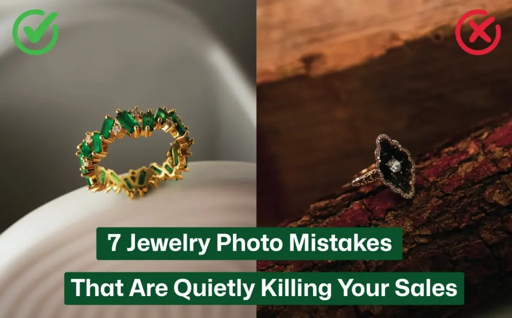
I still remember holding a gorgeous ring, watching tiny rainbows dance off the stones. In my hand it looked premium—so why did it look dull and cheap in my shop photos?
Like most sellers, I snapped a quick picture on my kitchen table… and instantly felt disappointed. The metal looked plastic, the stone looked cloudy, and all the magic vanished. For a moment I blamed the ring, but the truth was simple: the photo, not the jewelry, was the problem.
That’s when I realized just how much Jewelry Photography impacts the way a piece truly shines online.
Is This You? – Who This Guide Is For
If any of these situations sound familiar, you’re in the right place:
-
You sell jewelry online, maybe on Etsy, Shopify, Instagram or local marketplaces, and want your photos to reflect the quality of your work.
-
Your pieces look better in person than on the screen. The camera seems to dull the shine, flatten the textures or make the metal look cheap.
-
You don’t want to become a full-time photographer, but you know better photos mean more sales and fewer returns.
This guide isn’t for you if you’re looking for a 50-page manual on camera theory or if you’re perfectly happy outsourcing every product shot to a studio.
But if you’ve ever zoomed into a jewelry photo and felt a low-key pang of disappointment… keep reading.
Mistake 1: Shooting Dusty, Smudged Jewelry and Hoping No One Notices
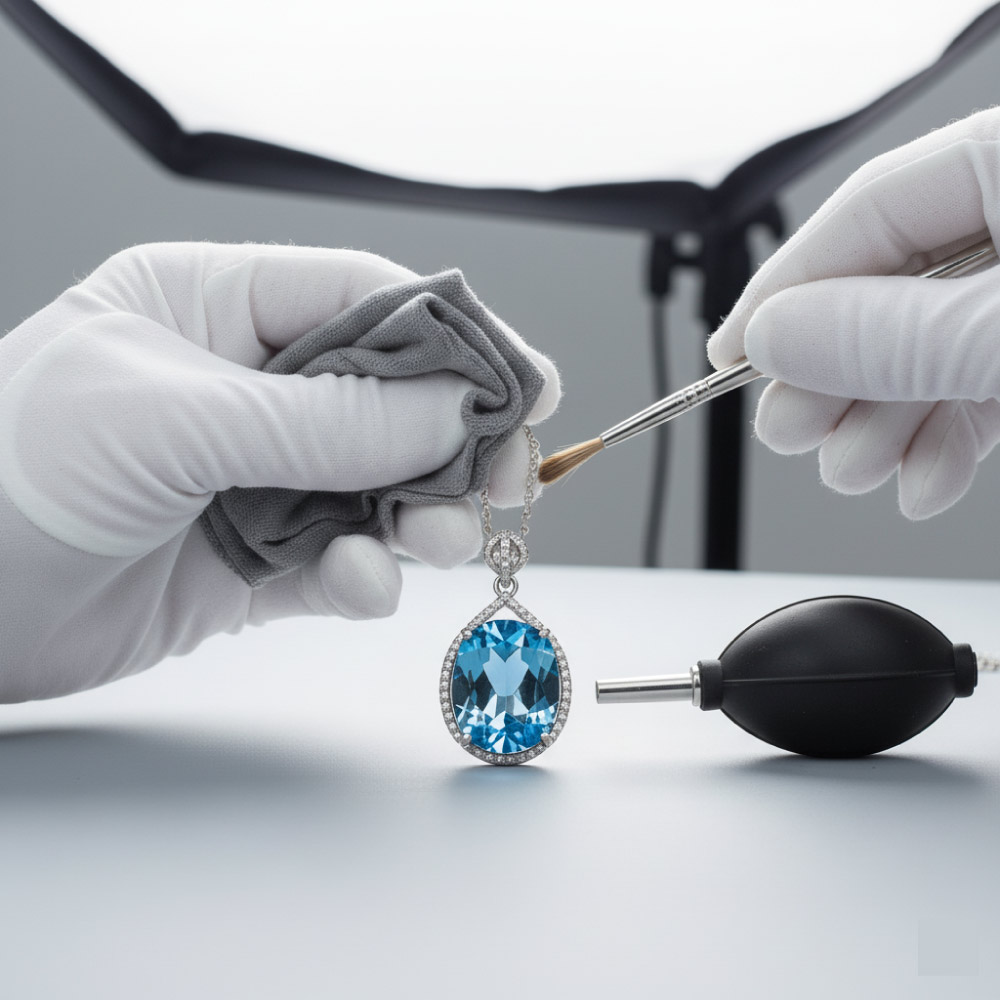
When you zoom in with a DSLR or macro lens, jewelry becomes brutally honest. Tiny dust, fingerprints, lint, or even a single stray hair turns into a big, ugly distraction in your final photo.
What looked “clean enough” to your eyes suddenly looks dull, dirty, and cheap on screen, and that instantly breaks customer trust.
Why This Happens
Jewelry photos are often captured in high resolution, which means the image is several times larger than the real piece. So even the smallest smudge appears huge and noticeable.
If the product looks dirty in the picture, buyers assume the real item will look the same.
My Simple 2-Minute Cleaning Ritual
I treat this like washing hands before cooking – quick, automatic, and essential.
1. Wear cotton gloves
No more fingerprints or oil marks from skin.
2. Wipe the piece with a microfiber cloth
Safely removes smudges, dust, and fog without scratching.
3. Use a soft brush or air blower
Gets into prongs, stones, and tiny gaps where dust hides.
4. Check under your main photography light
Rotate the jewelry to catch any spots you missed.
Two minutes here saves hours of editing later.
Tiny Cleaning Kit You Should Always Keep Nearby
| Item | Why It Helps |
|---|---|
| Microfiber cloths | Wipe smudges + fingerprints instantly |
| Cotton gloves | Prevent new marks while handling |
| Air blower | Remove lint stuck in prongs and settings |
| Soft makeup brush | Brush away fine dust safely |
| Small tray | Keeps pieces clean and off dusty surfaces |
Mistake 2: Letting Random Light Bulbs Decide How Expensive Your Jewelry Looks
Ever placed your jewelry under a yellow ceiling bulb or a harsh desk lamp? You’ve probably seen the disaster: weird colors, ugly shadows, blown-out highlights, and metal that suddenly looks plastic. Gold turns orange, silver turns greenish, stones lose sparkle, all because of bad lighting.
Light is the number one factor that decides whether your jewelry looks premium… or cheap.
The Simple Window Setup That Beats Most Studio Lights
You don’t need a fancy kit. Soft window light is often better.
How to do it:
-
Use indirect window light. Avoid direct sun; it creates harsh reflections.
-
Turn off all other lights. Mixing color temperatures creates strange tints.
-
Add a white foam board. It bounces light back and softens shadows.
-
Diffuse if needed. Tape a thin cloth or baking paper over the window to soften strong light.
This setup works with a DSLR and smartphones. Soft, natural, clean light = expensive-looking jewelry.
How to Control Reflections Without Killing the Sparkle
Jewelry reflects everything, the lights, the room, even your shirt.
-
Raise your light and shoot from a slightly lower angle.
-
Move the camera left or right a few centimeters. Tiny changes help a lot.
-
Use a DIY light tent (a white cloth over a box).
-
Hide your lens with a small piece of white paper/foil when reflections show up.
You don’t want “zero reflections” you want controlled, flattering highlights that give life to the piece.
Mistake 3: Treating Jewelry Like a Flat Object and Using Only One Boring Angle
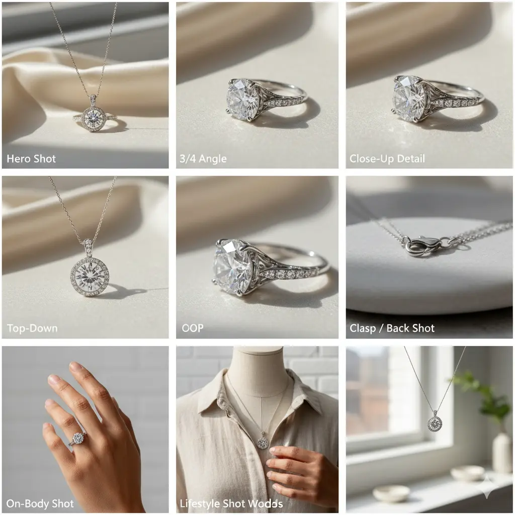
If you show just one photo, usually a flat lay, buyers feel unsure. They can’t see the band thickness, the side profile, the clasp, or the back. And uncertainty kills sales.
One angle makes customers think, “What are they hiding?”
Multiple angles build trust, reduce returns, and show the real beauty of your piece.
The Minimum Angle Set I Use for Every Jewelry Shoot
These shots give buyers everything they need:
-
Hero Shot- the main “wow” image.
-
3/4 Angle- shows depth, curves, and shape.
-
Top-Down- clean view of the face or layout.
-
Close-Up Detail- texture, stones, engraving.
-
Clasp / Back Shot- no surprises for buyers.
-
On-Body Shot- shows scale and how the piece sits.
Use your own hand, a friend’s hand, or a mannequin bust. Keep backgrounds simple and neutral.
Lifestyle Shots Without Models or Studio Hassle
You can create lifestyle-style images at home:
-
Use a clean wall, soft fabric, or a neutral shirt as background.
-
Photograph near a bright window.
-
Show how a necklace falls, how a ring sits, how an earring hangs.
-
Use different hands/skin tones by asking friends to help.
Keep props minimal. Let the jewelry be the hero.
Mistake 4: Shooting Handheld and Wondering Why Everything Looks “Almost Sharp”
“Almost sharp” is the worst kind of blurry.
Jewelry photos need crisp detail, but when you shoot handheld, every tiny shake gets magnified. The picture may look fine on your phone, but on a laptop or product page it looks soft, cheap, and unprofessional. Softness destroys the premium feel instantly.
The Tripod + Timer Combo That Makes Every Shot Look Expensive
The fix is ridiculously simple: stabilize your camera.
Here’s what I do for every close-up shot:
-
Mount your phone or camera on a tripod (even a tiny tabletop one works).
-
Set up your frame once and use grid lines to keep it straight.
-
Turn on a 2–5 second timer or use a remote shutter.
-
Start with ISO 100–200 and f/8–f/16 if you’re using a DSLR/mirrorless.
-
Let the shutter speed adjust automatically.
This setup prevents shake and gives you tack-sharp photos every time.
No Tripod? Quick Fixes
-
Stack books and lean your phone against them.
-
Use a mug, window ledge, or shelf as a support.
-
Brace your elbows on the table and hold your breath.
But honestly, even a $10 mini tripod pays for itself instantly.
Quick Solutions (Fast Fix Box)
-
Use tripod + timer → instant sharpness
-
Lower ISO → cleaner image
-
Brace phone on books if tripod missing
-
Turn on grid lines for straight framing
-
Don’t touch camera during shutter
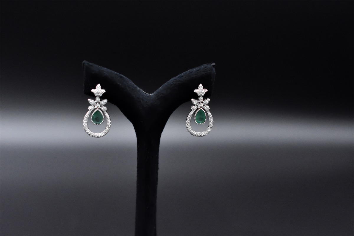
Mistake 5: Letting Backgrounds and Props Steal the Spotlight
Fancy marble, colorful flowers, patterned cloth, looks cool, right?
Not really.
Busy backgrounds pull the eye away from the jewelry. Instead of seeing the sparkle, viewers get lost in visual noise. Overactive props make your piece look like a side character, not the star.
Worse, strong backgrounds can shift color, making metals look off and stones look dull.
Safe Backgrounds That Always Look Premium
These clean options never fail:
-
White or off-white paper/card- clean, professional, marketplace-friendly
-
Soft gray or cream foam board- warm, elegant, minimal
-
Black velvet or acrylic- perfect for luxury gold, diamonds, pearls
-
Clear acrylic or Plexiglas- creates a beautiful reflection
Bend paper or board slightly so there’s no harsh horizon line.
The cleaner the background, the more expensive the jewelry looks.
When to Get Creative (Without Overdoing It)
If you’re shooting for:
-
Social media
-
Lookbooks
-
Website banners
…you can add light styling.
Use:
-
Soft fabrics (linen, silk, velvet)
-
Minimal stone or marble textures
-
One leaf, one petal, or one small prop (not a whole bouquet)
Rule of thumb: If your eye sees the prop first, it’s too much.
Quick Solutions (Fast Fix Box)
-
Use white/gray/black backgrounds for instant premium vibes
-
Keep props to one small accent
-
Bend the paper background for a seamless look
-
Blur your eyes → if the prop stands out, remove it
-
Keep colors neutral to avoid distortions
Mistake 6: Getting Color Wrong and Accidentally Lying to Your Customers
When gold looks orange and silver turns blue
Different light sources have different color temperatures. A warm lamp might make gold look too orange, while a fluorescent bulb makes silver turn blue or green.
When customers receive a piece that looks different from your photo, they feel cheated and may return it. That means lost trust and wasted shipping.
Keeping color honest without becoming a tech nerd
Color accuracy is simpler than it seems:
-
Don’t mix light sources. Natural light and artificial light have different color temperatures; mixing them creates unpredictable color casts. Choose one light source for your shot.
-
Use custom white balance. On a DSLR or mirrorless camera, set a custom white balance or choose a preset (Daylight, Cloudy, Tungsten) that matches your lighting. On a phone, adjust the “warmth” or “temperature” slider to correct extremes.
-
Compare your jewelry in hand vs on screen. Look at the piece under the same light as your shoot and ask, “Does this feel like the same piece?” Adjust until it does.
-
Use diffused light. Diffusing your light with a softbox or cloth helps maintain true color by reducing intense highlights.
Editing also helps. Adjust white balance and color temperature in post, but avoid over‑tweaking. The goal is to match reality, not create a fantasy version.
Mistake 7: Uploading Raw Photos With Zero Editing Polish
The “almost there” photo that’s quietly costing you clicks
Even with perfect lighting and a clean piece, your raw photos might look slightly dark, have uneven backgrounds or contain stray dust spots.
Buyers compare your product to polished, edited photos from bigger brands. If your images feel unrefined, shoppers will assume your product is too. You’re not trying to fake reality, just show your jewelry on its best day.
My simple, non‑overwhelming editing checklist for jewelry
Editing can feel intimidating, but it doesn’t have to. Here’s a straightforward sequence you can follow in any editing app (even free ones):
-
Crop and straighten. Center the piece and maintain consistent aspect ratios across your shop.
-
Clean up. Use healing or clone tools to remove dust, stray hairs and blemishes. Adorama suggests straightening and aligning images, removing blemishes and adjusting lighting contrasts.
-
Adjust exposure. Brighten gently until the metal and stones pop. Avoid blowing out highlights.
-
Add contrast and clarity. Increase contrast to give depth, but don’t push it so far that metal looks plastic.
-
Tweak white balance. Ensure whites are neutral and gold/silver look natural.
-
Sharpen selectively. Apply sharpening to stones and textures, not the entire image, to maintain realism.
Retouching is about honest enhancement. Avoid changing stone colors or smoothing metal so much it looks computer‑generated.
Edit to match how the piece looks in beautiful light, not to create a fantasy. And if you need to remove backgrounds or props like fishing line used to suspend earrings, do so in post.
Bonus: 5 Tiny Fixes That Make Your Jewelry Photos Instantly More Premium
Sometimes it’s the little tweaks that deliver the most dopamine. Here are five quick wins you can implement today:
-
Create a simple shot list before you start. List each piece and the required angles (hero, 3/4, top‑down, detail, clasp, on‑body). This ensures you don’t forget important shots and keeps your session focused.
-
Keep a consistent look across your store. Use similar backgrounds, lighting and aspect ratios to build brand trust. Cohesive imagery makes your shop feel polished.
-
Give every piece breathing room in the frame. Don’t crop too tight. Leave space around your piece to allow for cropping and text overlays later.
-
Use the grid on your phone or camera. Activate the 3×3 grid lines and align your piece along intersections. Straight horizons and centered subjects look immediately more professional.
-
Batch your workflow. Clean all pieces first, then shoot them all, then edit them all. Batching saves time and results in consistent lighting and settings.
Before/After Story: Turning a “Meh” Ring Photo into a Scroll‑Stopper
Let’s put these tips into action. I’ll walk you through a mini case study that illustrates the transformation. The before photo: a yellow kitchen light overhead, the ring placed on a busy granite countertop, shot handheld with one angle and zero cleaning.
The ring looked dark, with blown‑out highlights on the metal, and the countertop pattern competed for attention. When I zoomed in, fingerprints and lint were everywhere.
Now for the after. I cleaned the ring with a microfiber cloth and wore gloves. I moved to a window with indirect morning light and turned off all other lights.
I placed the ring on a simple white card bent into an “L” shape and positioned a foam board opposite the window to bounce light. I mounted my phone on a small tripod and used a three‑second timer.
I shot a hero shot, a 3/4 angle, top‑down, and a close‑up of the stone. In editing, I cropped, straightened, removed a couple of dust specks, brightened slightly and adjusted the white balance to match the real piece. The same ring, the same phone, a completely different level of perceived value.
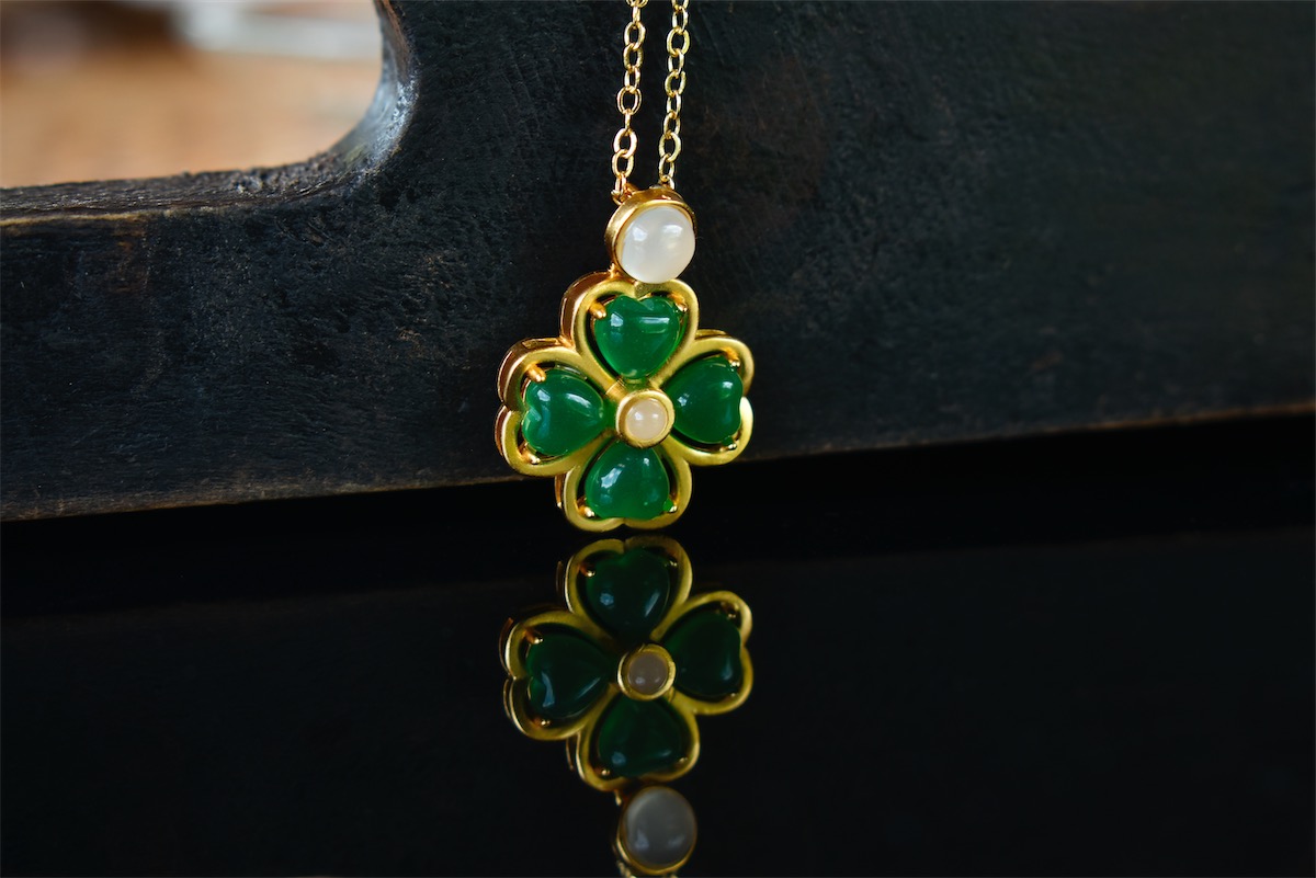
Below is a visual demonstration of a well‑lit ring on a tripod near a window, captured with soft natural light bouncing off a white foam board. Notice how clean and crisp the piece looks compared to an average handheld snapshot:
If you ever want this polished look without doing the edits yourself, check out our professional photo editing services.
Wrap‑Up: Your Jewelry Deserves Better Photos (And Now You Know How)
If your jewelry looks better in your hand than on your website, it’s not a sign that your skills are lacking. It’s usually a combination of a few fixable mistakes.
You’ve now got the map to fix them: clean your pieces, master soft light, show multiple angles, stabilize your shots, simplify backgrounds, be honest with color, and edit with care. You don’t need perfection on day one. Even changing two or three of these habits will make a visible difference in your next shoot.
Here’s my challenge to you: pick one piece that never sells because the photos aren’t doing it justice. Reshoot it using this guide. Clean it, set up by a window, stabilize your camera, and take those minimum angles.
Edit it lightly and upload the new set. Watch how differently people respond. Let your photos finally match the quality of the jewelry you worked so hard to create.
FAQ: Avoid These 7 Jewelry Photography Mistakes Today
1. Why do my jewelry photos look dull?
Because the light is harsh or uneven. Use soft, diffused lighting.
2. How do I stop reflections on metal?
Use a light tent or white reflectors to block unwanted reflections.
3. What background should I use?
Neutral colors, white, gray, or beige, keep the focus on the jewelry.
4. Why are my photos blurry?
Camera shake or a wide aperture. Use a tripod and shoot at f/8–f/11.
5. Do I need to clean the jewelry first?
Yes. Dust and fingerprints show up instantly in high-detail shots.
6. How do I make gemstones pop?
Angle the light to hit the stone and enhance colors lightly in editing.
7. Can editing fix bad jewelry photos?
Only partially. Good lighting and sharp focus must come first.